Simpler GUI improvements for openPETRA Menu system
Objective / Overview
Improve the user experience of the current openPETRA main menu. It is currently functional, but not as functional and not as nicely laid out as we would want to have it.
Desired Outcome
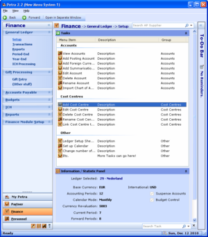
ChristianK created a standalone demo application a few years ago which demonstrates all the main features and the desired layout that the openPETRA menu system should get in the end. Several of those functional and layout improvements should be accomplished by implementing as many of the tasks in this project as possible.
Each of the tasks in this project has a documented desired outcome on its own.
Scope
Some of the 'simpler' tasks that will help improve the openPETRA menu system are part of this project. There is another project which contains more complicated tasks.
- Breadcrumb Trail above Task List view
- Allow horizontal collapsing/expanding of the Module Navigation (TPnlAccordion)
- Utilizing the Collapsing UserControl in the Module Navigation (TPnlAccordion)
- Utilizing the Collapsing UserControl as ‘Dashboards’ in the Task List view
- Concept (and possibly implementation) of Back/Forward Buttons navigation (like web browser)
- Nicer Tasks List (perhaps with optional help texts) (more involved)
Each of the tasks can be done on its own, there are no interdependencies.
