Creation of a UserControl: Task List: Difference between revisions
No edit summary |
(→Step 5) |
||
| (3 intermediate revisions by the same user not shown) | |||
| Line 2: | Line 2: | ||
There are three different styles in which a list of 'Task Items' should be able to be displayed in openPETRA (see screenshots on the side). | There are three different styles in which a list of 'Task Items' should be able to be displayed in openPETRA (see screenshots on the side). | ||
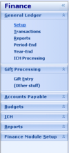
[[File:Task_Panel_Sample_1a_-_Accordion_Panel_Demo.png|100px|thumb|right|Menu | [[File:Task_Panel_Sample_1a_-_Accordion_Panel_Demo.png|100px|thumb|right|One vsHorizontalCollapse-Style Collapsible Panel (as 'Navigation Panel' in openPETRA Main Menu) hosting several vsAccordionPanel-Style Collapsible Panels which are hosting several vsAccordionPanel-Style Task Lists]] | ||
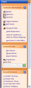
[[File:Task_Panel_Sample_3_-_Task_Panel.png|100px|thumb|right| | [[File:Task_Panel_Sample_3_-_Task_Panel.png|100px|thumb|right|Several vsTaskPanel-Style Collapsible Panels hosting several vsTaskPanel-Style Task Lists]] | ||
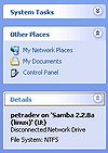
[[File:TaskPanel_WindowsExplorer_WinXP.jpg|100px|thumb|right|Several vsTaskPanel-Style Collapsible Panels hosting several vsTaskPanel-Style Task Lists - WinXP Explorer style (this is the 'Visual Style' we roughly want to mimic with vsTaskPanel, not the 'orangey' one above)]] | |||
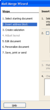
[[File:Task_Panel_Sample_4_-_Shepherd_Page_Panel.png|100px|thumb|right| | [[File:Task_Panel_Sample_4_-_Shepherd_Page_Panel.png|100px|thumb|right|A vsShepherd-Style Collapsible Panel hosting a vsShepherd-Style Task List]] | ||
With 'Task Items' we mean the list of text items within a surrounding panel. | '''With 'Task Items' we mean ''only'' the list of clickable text items within a surrounding panel.''' | ||
The Task Items will perform varying functionality when clicked or selected by keyboard - depending on the context in which the Task Items are to be shown. The performing of the functionality is outside of the scope of this implementation as this will be done by the Control who 'hosts' the Task Items (a Panel of some sort). | The Task Items will perform varying functionality when clicked or selected by keyboard - depending on the context in which the Task Items are to be shown. The performing of the functionality is outside of the scope of this implementation as this will be done by the Control who 'hosts' the Task Items (a Panel of some sort). | ||
Notes: | |||
* The corresponding Bug (=Feature Request) is [https://sourceforge.net/apps/mantisbt/openpetraorg/view.php?id=204 Bug #204]. | |||
* The Bazaar Branch in which the development is to happen is called 'dev_0000204_studentsJ2011_usercontrol_tasklist'. | |||
==Desired Outcome== | ==Desired Outcome== | ||
| Line 142: | Line 144: | ||
* Test and demonstrate the UserControl in the WinForms Designer. | * Test and demonstrate the UserControl in the WinForms Designer. | ||
* Add XML Documentation to | * Add XML Documentation to | ||
** the Class | ** the Class; | ||
** the Properties | ** the Properties; | ||
** public and private Methods | ** public and private Methods; | ||
** the Enum | ** the Enum; | ||
** the Delegate | ** the Delegate. | ||
** The easiest way to add XML Documentation is to use SharpDevelop and do the following: | |||
*** Place cursor in empty line above a Class, Property, Method, Enum, Delegate. Position the cursor on the same indentation level as the code for the Class, Property, Method, Enum, Delegate in the line below. | |||
*** Enter ' <code>///</code> ' (triple forward slash) | |||
*** SharpDevelop will have interted a XML Documentation template for you to fill in! :-) | |||
* Check conformance with the openPETRA Code Style Guide! | * Check conformance with the openPETRA Code Style Guide! | ||
==Approval of Functionality and Program Code== | ==Approval of Functionality and Program Code== | ||
Latest revision as of 14:47, 19 January 2011
Introduction
There are three different styles in which a list of 'Task Items' should be able to be displayed in openPETRA (see screenshots on the side).
With 'Task Items' we mean only the list of clickable text items within a surrounding panel.
The Task Items will perform varying functionality when clicked or selected by keyboard - depending on the context in which the Task Items are to be shown. The performing of the functionality is outside of the scope of this implementation as this will be done by the Control who 'hosts' the Task Items (a Panel of some sort).
Notes:
- The corresponding Bug (=Feature Request) is Bug #204.
- The Bazaar Branch in which the development is to happen is called 'dev_0000204_studentsJ2011_usercontrol_tasklist'.
Desired Outcome
- Creation of one UserControl which can present a list of 'Task Items' and whose 'look and feel' can be set to three different styles, as shown in the screenshots along the side.
- The different styles will need to affect
- the font
- the gradient colours of the background (see screenshot 'Menu Items in Accordion Panel' along the side)
- indentation of Task Items
- space between Task Items
- compare screenshots 'Menu Items in Accordion Panel' and 'Pages in Shepherd Navigation Panel' along the side
- appearance of dividing lines (see below)
- appearance of disabled Task Items (see below)
- The different styles will need to affect
- The UserControl needs to accept the Task Items as a single XmlNode.
- This XmlNode will have child XmlNodes which represent the actual Task Items.
- The UserControl needs to be able to 'grow' or 'shrink' itself in vertical direction - depending on the number of XmlNodes (also dynamically, as some Task Items might be hidden initially).
- Calling of a Delegate (.NET implementation of a Callback) on 'activation' (clicking or keyboard-selection) of a Task Item.
- Implement optional automatic numbering of Task Items ("1. xxx", "2. yyy") (See screenshot 'Pages in Shepherd Navigation Panel' along the side).
- Implement Sub-task Items (only one level deep), which are found as children of the XmlNodes of the Task Items. Sub-task Items should be shown indented under their 'parent' Task Items and follow the numbering of their 'parent' Task Item, if optional numbering is switched on ("1.1 xzxz", "1.2 yzyz" under "1. xxx").
- Navigation between the Task Items and 'activating' of a Task needs to be possible by keyboard!
- <CURSOR-UP> and <CURSOR-DOWN> keys for navigation
- 'Highlighting' of currently selected Task Item. The style of the highlighting will be different between the three different display styles.
- see screenshot 'Pages in Shepherd Navigation Panel' along the side (rectangle with dotted line within the blue selection)
- <ENTER> and <SPACE> keys for 'activation' of selected item
- Task Item text will need to be able to show an underlined character (designated by an ampersand & sign in the text) and the Task Item will need to be 'activated' if the user presses <ALT>+<{underlined character}>.
- see screenshot 'Menu Items in Accordion Panel' along the side (&Transactions Task Item)
- Optional 'highlighting' of 'activated' Task Item. The style of the highlighting will be different between the three different display styles and be different from the highlighting of the currently selected Task Item.
- compare screenshots 'Menu Items in Accordion Panel' and 'Pages in Shepherd Navigation Panel' along the side
- Disabled Task Items will need to be shown differently and the user must not be able to 'activate' them or navigate to them.
- Appearance should be 'greyed out', except for Task Items in style 'Menu Items in Accordion Panel' - those should be shown 'etched'.
- Hidden Task Items must be possible.
- Those should not be shown, but it must be possible to show them programmatically at any time.
- Public Methods for Disabling/Enabling and Hiding/Showing of individual Task Items must be implemented.
- The UserControl needs to work with the 'Large Fonts (120 DPI)' display setting.
- If you can get it to work with any arbitrary DPI setting this would be good, but this isn't a requirement.
- The UserControl should work on Linux and Mac OS X, if possible (this isn't a requirement).
- Don't spend too much time on this - if you can get it to work without too much effort then do it, otherwise just write down the problems you experience so we can follow it up in time.
- Test this only once a while during development - testing this shouldn't consume much time.
- OPTIONAL: Ability for drawing of dividing lines between Task Items would be nice (see screenshot 'Action Items in Task Panel' along the side)
- Appearance of dividing lines should be different on different Display Styles (e.g. dashed or solid line, different colour of the line, etc.)
- OPTIONAL: Optional Icons in front of task items would be nice.
- When at least one icon is present, all the Task Items will need to be indented by the width of the icons plus a few pixels for spacing
- see screenshot 'Action Items in Task Panel' ('General Tasks' Panel) along the side
- Icons need to be reduced to a 'dimmed greyscale representation' if their corresponding Task Item is disabled
- When at least one icon is present, all the Task Items will need to be indented by the width of the icons plus a few pixels for spacing
Outline of the Solution
This lists the basic steps for getting to the desired outcome.
Where references are made to items which are described in the 'Desired Outcome' section, '[REF]' will be mentioned.
Step 1
Important: Follow the openPETRA 'Coding Standard and Guidelines' for all code that you write!
- Create a new Class within the Ict.Common.Controls C# Project (located in \csharp\ICT\Common\Controls) and name its file 'VisualStyles.cs'. Name the Class 'TVisualStyles'. This Class will also be used by the 'Collapsible Panel' Project!
- Add a public enum to that file, outside the Class definition.
- Name it 'TVisualStylesEnum'.
- Add the following values: vsAccordionPanel, vsTaskPanel, vsDashboard, vsShepherd, vsHorizontalCollapse
- Only vsAccordionPanel, vsTaskPanel and vsShepherd will be used by the Task List UserControl.
- Add variables to the Class to hold values for the following settings:
- Title Text (Type 'Font'), Title Text Colour (Type 'Color'), Title Panel Gradient Start Colour and Title Panel Gradient End Colour (Type 'Color'), Title Panel Gradient Mode (Type 'LinearGradientMode'), Title Panel Height (Type 'int'), Content Panel Gradient Start Colour and Content Panel Gradient End Colour (Type 'Color'), Content Panel Gradient Mode (Type 'LinearGradientMode').
- Ask ChristianK to supply you with the values for the variables.
- The Class shall not have a 'default Constructor' (=without any arguments), but a Constructor that takes one Argument of Type 'TVisualStylesEnum'.
- This Constructor shall set values of the individual the variables, which will be handed out in Properties (see below). The variable's values will vary, depending on the enum value. ChristianK will give you those values (for vsTaskPanel we want the same 'blue tone' colour scheme as for vsAccordionPanel, not the 'orange tone' colour scheme that is shown on the screenshot for the 'TaskPanelStyle').
- Add read-only Properties to the Class, one for each of the variables.
- Create a new UserControl within the Ict.Common.Controls C# Project and name its file 'TaskList.cs'. Name the Class 'TTaskList'.
- Add a 'MasterXmlNode' Property of type XmlNode.
- Create the Task Items according to the XmlNodes present in the 'MasterXmlNode' Property.
- The Task Items need to be rebuilt if the 'MasterXmlNode' Property is changed!
- Implement the building of the Task Items in a private Method that gets called from the 'setter' of this Property.
- Task Items shall be represented as LinkLabels Controls. Their Text Property should be set from the 'Label' Child Node of each TaskItem's XmlNode.
- A simple example implementation can be found in the Constructor of Class Ict.Common.Controls.TPnlAccording (look at the inner 'while' loop that creates LinkLabels).
- The Task Items need to be rebuilt if the 'MasterXmlNode' Property is changed!
- Add ability to the UserControl to 'grow' or 'shrink' itself in vertical direction [REF].
- Test and demonstrate this in a small test application, which you should create for that purpose.
- The Test Application is to be created in the directory \csharp\ICT\Testing\Common\Controls (doesn't exist yet) and to be called 'ControlTestBench.sln'.
- It should have a main Form with some Buttons. Each of the Buttons should launch a test Form that is specific for a certain UserControl.
- Co-ordintate yourself with the creators of the 'Task List' to ensure that only one of you creates that application - namely the one who gets to this step first.
At that point this early version of the UserControl could be given to the implementors of the Collapsing Panel Project so they can implement the hosting of this UserControl.
Step 2
- Add a 'VisualStyle' Property of Type 'TVisualStyles'.
- Implement the change of visual style in a private Method that gets called from the 'setter' of this Property.
- Change of visual style needs to affect various things (e.g. font, indentation). See [REF] and screenshots along the side.
- Use UserControl 'Ict.Common.Controls.TPnlGradient' instead of a standard WinForms Panel to have a panel that supports a gradient background.
- To be able to draw gradients other than in vertical direction you will need to extend 'TPnlGradient' with a Property 'GradientMode' of Type 'LinearGradientMode' and change the Method 'OnPaint' to use its setting. The default setting of the Property should be 'LinearGradientMode.Vertical'. (Check out the horizontal gradient of the Title Panel in screenshot 'Action Items in Task Panel'.)
- While you are at it, make all the public variables private and introduce Properties with getters and setters...
- Add ability to have disabled Task Items and hidden Task Items [REF].
- Should be set from the 'Enabled' and 'Hidden' Child Nodes of each TaskItem's XmlNode, respectively
- Add public Methods 'DisableTaskItem' and 'EnableTaskItem' as well as 'HideTaskItem' and 'ShowTaskItem' to be able to toggle these attributes programmatically at run time
- Those Methods need to have a XmlNode Argument which specifies the desired TaskItem.
- Implement optional automatic numbering of Task Items ("1. xxx", "2. yyy") [REF].
- Add Property 'AutomaticNumbering' of Type bool
- Set this Property automatically to true when switching 'DisplayStyle' to the 'Shepherd Navigation' style.
- Automatic numbering needs to work with every style.
- Implement Sub-task Items (only one level deep) [REF].
- continue automatic numbering (nested) if switched on [REF]!
- Test and demonstrate the new functionality in the test application.
Step 3
- Create two custom Events: 'KeyboardNavigationPastTopMostItem' and 'KeyboardNavigationPastBottomMostItem'.
- Add navigation by keyboard between the Task Items and its hosting Form/Control [REF].
- Dividing lines and disabled Task Items must be skipped over when navigating with the keyboard (hidden Task Items as well, obviously)
- Implement 'Highlighting' of currently selected Task Item. [REF]
- When the user reaches the topmost Task Item and presses <CURSOR-UP> or reaches the bottommost Task Item and presses <CURSOR-DOWN>, the highlighting of the currently selected Task Item should be removed and the Event 'KeyboardNavigationPastTopMostItem' or 'KeyboardNavigationPastBottomMostItem' shall be raised. (On receiving those Events, the screen which hosts this UserControl can move the input focus to the Control which is before/next the UserControl in the Tab Order of the screen).
- Implement 'activation' ('Clicking') of a Task Item by keyboard (<ENTER> and <SPACE> keys) [REF]
- Implement 'activation' ('Clicking') of Task Item via shortcut key handling for <ALT>+<{underlined character}> (created by an ampersand & sign in the Tast Item's text) [REF]
- Create a Delegate (.NET implementation of a Callback) named 'TaskItemActivated' [REF]
- Needs to have an Argument of type XmlNode that points to the Task Item that got 'activated' (see next bullet point).
- Call Delegate 'TaskItemActivated' on 'activation' (clicking or keyboard-selection) of a Task Item [REF].
- Optional 'highlighting' of 'activated' Task Item. [REF]
- Test and demonstrate the new functionality in the test application.
Step 4
This step contains only optional features and could therefore be skipped entirely.
- Add capability for painting Dividing Lines between Task Items [REF]
- Those shall be represented as XmlNodes whose 'Label' Child Node of the TaskItem's XmlNode is "-".
- Note: This is an optional feature.
- Add capability for optional Icons in front of task items [REF]
- The icon file name would be specified in the 'IconName' Child Node of each TaskItem's XmlNode.
- Icons needs to be shown in gray-scale colours rather than full colour if their Task Item is disabled (ask ChristianK about how to do this).
- Note: This is an optional feature.
- Test and demonstrate the new functionality in the test application.
Step 5
- Add .NET Attributes to Properties, public Methods and to the Delegate for use in the WinForms Designer.
- Test and demonstrate the UserControl in the WinForms Designer.
- Add XML Documentation to
- the Class;
- the Properties;
- public and private Methods;
- the Enum;
- the Delegate.
- The easiest way to add XML Documentation is to use SharpDevelop and do the following:
- Place cursor in empty line above a Class, Property, Method, Enum, Delegate. Position the cursor on the same indentation level as the code for the Class, Property, Method, Enum, Delegate in the line below.
- Enter '
///' (triple forward slash) - SharpDevelop will have interted a XML Documentation template for you to fill in! :-)
- Check conformance with the openPETRA Code Style Guide!
Approval of Functionality and Program Code
- Have both the functionality and the program code reviewed by ChristianK and Prof. Nurkkala.
- Show the UserControl in the WinForms Designer. Documentation of Properties, Events and the design-time experience will be evaluated by ChristianK and Prof. Nurkkala.
- Demonstrate the Task List in the test application
- on its own
- show several instances to demonstrate the auto-sizing capability
- in combination with the 'Collasping Panel' (no matter what stage of completion that UserControl is, if it is able to host the Task List and is able to collapse/expand then this should be fine).
- show that the Task List UserControl works on the 'Large Fonts (120 DPI)' display setting
- on its own
- A special point will be awarded if the Task List UserControl is integrated into the WinForms Generator!
- ChristianK will help with that
- A special point will be awarded if the Task List UserControl works well on either Linux and Mac OS X!


