Navigation and Dashboard: Difference between revisions
Jump to navigation
Jump to search
| Line 17: | Line 17: | ||
* only one panel is open at the time | * only one panel is open at the time | ||
* the other panels are collapsed; they can be shown as items at the bottom of the side panel, or as icons, or hidden completely (a menu brings them back) | * the other panels are collapsed; they can be shown as items at the bottom of the side panel, or as icons, or hidden completely (a menu brings them back) | ||
== ListView == | == ListView == | ||
Revision as of 09:00, 26 August 2009
current implementation
- functionality split across several modules; partner module is used from finance module and other interoperation
- functionality is hidden in long menu paths
- can edit previous partners, special menu with last used partners
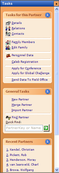
New TaskPanel Layout
- a task panel consists of several sections that can be extended and collapsed
- the goal is to guide the user quickly to the tasks that she needs to do, and links to recent activity of the user
- even quick find controls can be integrated
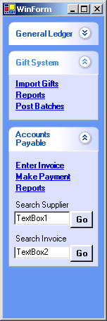
- simple example of how to use normal Panels, without using yet another user control: http://www.codeproject.com/KB/vb/HomemadeXPPanel.aspx
- (1) sample for the Partner Find Screen (was done using http://www.codeproject.com/cs/miscctrl/TgXPPanel.asp)
- (2) another sample for Finance Module screen
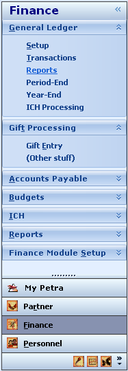
- (3) for the main screen
Outlook like Panel
- only one panel is open at the time
- the other panels are collapsed; they can be shown as items at the bottom of the side panel, or as icons, or hidden completely (a menu brings them back)
ListView
- in the centre panel, a List view (list, big icons, small icons; using groups; using descriptions ie subitem) shows the available tasks
Dashboard
- above or below the listview, we can have several other panels
- eg. a dashboard with charts etc
Calendar panel
- on the right side, there is a collapsable panel with calendar, and reminders etc


