Creation of a UserControl: Collapsible Panel: Difference between revisions
No edit summary |
No edit summary |
||
| Line 21: | Line 21: | ||
* it can host either a '[[Creation of a UserControl: Task List |Task List]]' or an arbitrary UserControl as a content; | * it can host either a '[[Creation of a UserControl: Task List |Task List]]' or an arbitrary UserControl as a content; | ||
* it auto-sizes in vertical direction to always fit the size of the content. | * it auto-sizes in vertical direction to always fit the size of the content. | ||
There is another Project, '[[Creation of a UserControl: Task List]]', whose UserControl is specifically designed to be hosted inside a Collapsible Panel. | There is another Project, '[[Creation of a UserControl: Task List]]', whose UserControl is specifically designed to be hosted inside a Collapsible Panel. | ||
Note: The corresponding Bug (=Feature Request) is [https://sourceforge.net/apps/mantisbt/openpetraorg/view.php?id=205 Bug #205]. | |||
Revision as of 16:28, 7 January 2011
Introduction
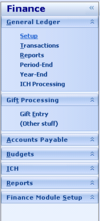
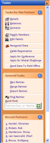
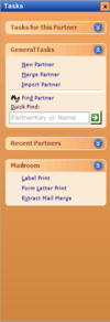
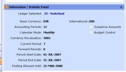
There are three different styles in which a 'Collapsible Panel' should be able to be displayed in openPETRA (see screenshots on the side).
With 'Collapsible Panel' we mean each of the panels that host either a list of Task Items, or a UserControl with custom content (especially in case of Dashboards, but not limited to them).
The main feature of a Collapsible Panel is that it can be either expanded or collapsed.
- In the collapsed state only the Title Panel (a small panel containing a title text and a Button for expanding it and an optional Icon) is left. In this state the Collapsible Panel does not take up much space on the screen.
- In the expanded state the Title Panel remains and in addition to that the actual content of the Collapsible Panel (a Task List or a UserControl) is shown. In this state the Collapsible Panel takes up at least as much space on the screen as its contents plus the space the Title Panel needs.
The other features of a Collapsible Panel are
- it supports different 'Styles', as shown in the screenshots along the side;
- it can host either a 'Task List' or an arbitrary UserControl as a content;
- it auto-sizes in vertical direction to always fit the size of the content.
There is another Project, 'Creation of a UserControl: Task List', whose UserControl is specifically designed to be hosted inside a Collapsible Panel.
Note: The corresponding Bug (=Feature Request) is Bug #205.
Desired Outcome
- Creation of one UserControl which acts as a 'Collapsible Panel' whose 'look and feel' can be set to three different styles, as shown in the screenshots along the side.
- The different styles will need to affect
- the Title Panel
- font and colour of the Title Text
- gradient colours of the Title Panel (compare screenshots 'Inside the Accordion Panel' and 'Inside a Task Panel' along the side)
- two icons for collapsing/expanding on the Title Button
- the Content Panel
- gradient colours of the Content Panel (which hosts the actual content, e.g. Task List or a UserControl) (see screenshot 'Inside the Accordion Panel' along the side)
- the Title Panel
- The different styles will need to affect
- The UserContol needs to collapse when the collapse/expand Button is clicked and it is currently expanded, and it needs to expand when the collapse/expand Button is clicked and it is currently collapsed.
- It shall also toggle its collapsed/expanded state if the Title Panel, the Title Text or the Title Icon is clicked.
- Dealing with hosted content
- When the UserControl is hosting the 'Task List', it needs to accept the Task Items as a single XmlNode and pass it on to the Task List.
- When the UserControl is hosting an arbitrary UserControl, it needs to accept information about it so it can instantiate it.
- The UserControl needs to dynamically create the hosted content (a Task List or an arbitrary UserControl) the first time it is expanded.
- This is in order to speed up the realisation (painting) of a screen that hosts a Collapsing Panel which is in its 'collapsed' state (only the Title Panel needs to be realised in this case!).
- The UserControl needs to be able to auto-size itself in vertical direction - depending on the size needed for hosting the Task List or a UserControl in the Content Panel.
- The UserControl needs to have a read-only Property 'IsCollapsed'. (This can be used by the screen which hosts this UserControl to inquire its state.)
- The UserControl needs to have Properties to set the Title Text and the optional Title Icon.
- The UserControl needs to raise Events when it got Expanded or Collapsed.
- On receiving those Events, the screen which hosts this UserControl do any necessary screen re-arrangement, or change the tick on a MenuItem, for example.
- Navigation between the content hosted in the Content Panel (Task List or arbitrary UserControl) and the Title Panel needs to be possible by keyboard!
- <CURSOR-UP> and <CURSOR-DOWN> keys for navigation
- <ENTER> and <SPACE> keys for changing the collapsed/expanded state if the Focus is on the Title Text
- 'Highlighting' of Title Text if the Focus is there
- Highlighting should be done by painting a rectangle with dotted line around the Title Text
- Title Text will need to be able to show an underlined character (designated by an ampersand & sign in the text). If the user presses <ALT>+<{underlined character}>, the collapsed state shall be changed to expanded (only if the UserControl is currently collapsed) and the input Focus shall be given to the Content Panel.
- See screenshot 'Menu Items in Accordion Panel' along the side (&General Ledger Collapsible Panel)
- Disabling of a Collapsible Panel must be possible, but only if it is in its 'collapsed' state.
- Hiding of a Collapsible Panel must be possible, independent of its collapsed/expanded state.
- Public Methods for Disabling/Enabling and Hiding/Showing of a Collapsible Panel must be implemented.
- Method for Disabling needs to throw a custom Exception if it is called while the Collapsible Panel is expanded.
Outline of the Solution
This lists the basic steps for getting to the desired outcome.
Where references are made to items which are described in the 'Desired Outcome' section, '[REF]' will be mentioned.
Step 1
TODO Start with existing UserControl and generalize it.
Step 2
TODO
Step 3
TODO
Step 4
- Add .NET Attributes to Properties, public Methods and to the Events for use in the WinForms Designer.
- Test and demonstrate the UserControl in the WinForms Designer.
- Add XML Documentation to
- the Class
- the Properties
- public and private Methods
- the Enum
- the Events
- Check conformance with the openPETRA Code Style Guide!
Approval of Functionality and Program Code
- Have both the functionality and the program code reviewed by ChristianK and Prof. Nurkkala.
- Show the UserControl in the WinForms Designer. Documentation of Properties, Events and the design-time experience will be evaluated by ChristianK and Prof. Nurkkala.
- Demonstrate the Collapsing Panel in the test application
- show several instances to demonstrate the auto-sizing capability
- in combination with the 'Task List' (no matter what stage of completion that UserControl is, if it is past 'Step 1' this should be fine).
- in combination with an arbitrary UserControl
- show several instances to demonstrate the auto-sizing capability
- One special point will be awarded if the Collapsing Panel can be demonstrated inside openPETRA!
- ChristianK will help with that
- An additional special point will be awarded if the Collapsing Panel UserControl is integrated into the WinForms Generator!
- ChristianK will help with that
